An mobile app that celebrates social networking as an embodied and emergent user experience based on primary research with the visually impaired community and around a concept of spatial information architecture.
UI/UX Designer and Creative Technologist
Figma, Unity, C#, Blender, Raspberry Pi, SuperCollider, Ableton, Illustrator, After Effects, and Photoshop
MFA Thesis project

As mobile technology advances, social interaction has shifted from in-person to app-based platforms like Snapchat and Instagram—products driven by attention-based ad revenue and increasingly immersive features, such as Snap’s AR tools introduced in 2015.
Yet, for the 8% of the U.S. population with visual impairments, access to these digital spaces remains limited, contributing to social isolation and related health concerns, according to Georgetown University’s Health Policy Institute./Source

Can a social networking app accommodate differences in its users' visual abilities?
Only 0.1% of tweets include alt-text descriptions /Source
To better understand how visually impaired individuals engage with smartphone technology, I interviewed two community members:

Various app features and visual languages were analyzed along a social-to-utility and visual-to-audio axis.

While researching Snapchat, I was drawn to the Periscope-like interaction of the Snap Map—a top-down view representing localized user-generated content. Its design reminded me of clouds. However, since the platform centers on visual media, I chose to explore an audio-focused alternative.

Using Unity3D, different cloud types were examined and interpreted into respective spatialized prototypes.


Audio effects and behaviors were applied to explore the emergent qualities of collective Audio Notes within a set space.


Binaural audio guides user navigation, with each Audio Note acting as a dynamic beacon that adjusts it's volume based on the user's location.


Prototyping in an interactive simulated environment transformed loose ideas into a cohesive, novel interaction paradigm.
Three volunteers explored each cloud type in the interactive Unity scenes and shared feedback on usability, visual language, and immersion.

Drawing from user testing, advisor feedback, and extensive research, I distilled three key insights:
Orientation and Mobility (O&M) techniques help visually impaired individuals construct mental maps of space using environmental sounds, enabling safe, independent navigation without relying on others.
The Stratus and Nimbus interaction design studies most effectively conveyed the concept of networked audio and the emergent behaviors shaped by content relevance and spatial density.
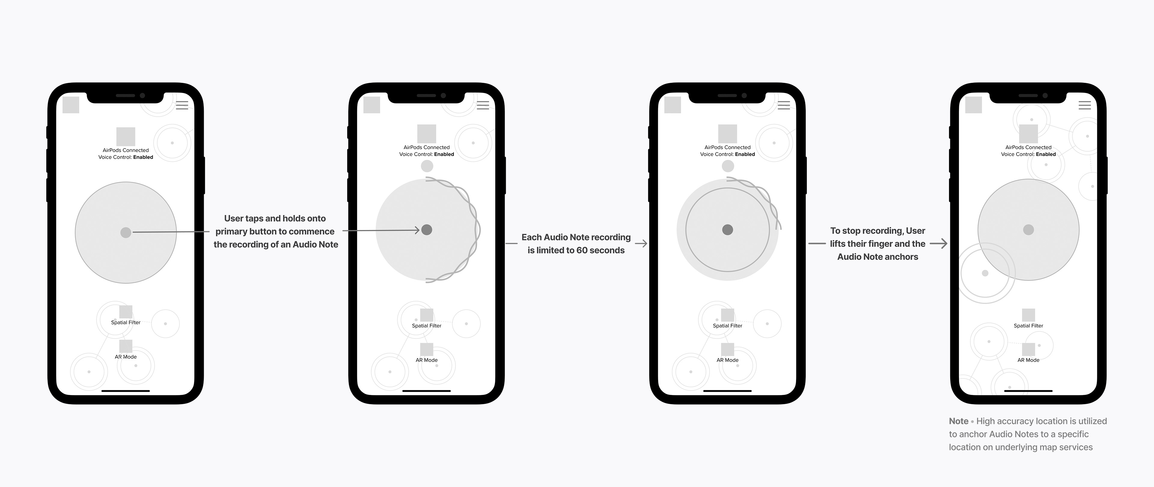
Each Audio Note emits a beacon sound and audio content that helps users form a mental map of their surroundings while fostering connection. The primary action button is centered on screen for easy access, eliminating reliance on VoiceOver and ensuring all users can engage with the app’s core function.
Users can toggle between AR and Planar modes, with spatial filters triggered by natural language processing. In both modes, the UI and beacon cues communicate how the system interprets nearby Audio Note content and density—guided by insights from the Nimbus and Cumulus interaction design studies.


User feedback raised a key question: How can the cloud metaphor be better expressed visually and behaviorally? This led me to explore unique cloud forms using a cloud tank. I captured the analog effects on camera at 120 fps for further visual development.


One cloud tank experiment captured the essence of a fluffy cloud. A still became the app’s background, and its adjusted color palette informed the entire interface. The cloud motif extended across animations and UI elements for a cohesive visual language.

Inspired by the circular, billowy motion observed in the cloud tank, I designed the Audio Note creation animation to evoke a similar soft, organic quality.
To evoke the softness of a cloud, I feathered the edges of key visual elements, including menus. The typeface, Proxima Nova, complemented this approach with its clean, rounded forms.

I designed Audio Notes to be easily identifiable and meaningful within the UI. When clustered, they take on cloud-like, emergent qualities. Beacon sounds help orient users to individual or grouped Notes, while a central node serves as each Note’s GPS anchor.


Users can navigate a space filled with Audio Notes hands-free, guided by spatial beacon sounds through their wireless earbuds.

Users simply walk toward a fixed Audio Note, which plays automatically as spatialized audio—offering a sense of presence and perspective from others in the space.
View entire interaction
To record an Audio Note, a user simply presses the central button. When up to four users are within 3 feet of each other, each of their voices is recorded and spatialized—preserving the conversation as an immersive, multi-voice recording others can later explore.
View entire interaction


In denser environments, users can activate a spatial filter to surface Audio Notes based on discussed topics—enabled by the app’s natural language processing (NLP) capabilities.
View entire interaction
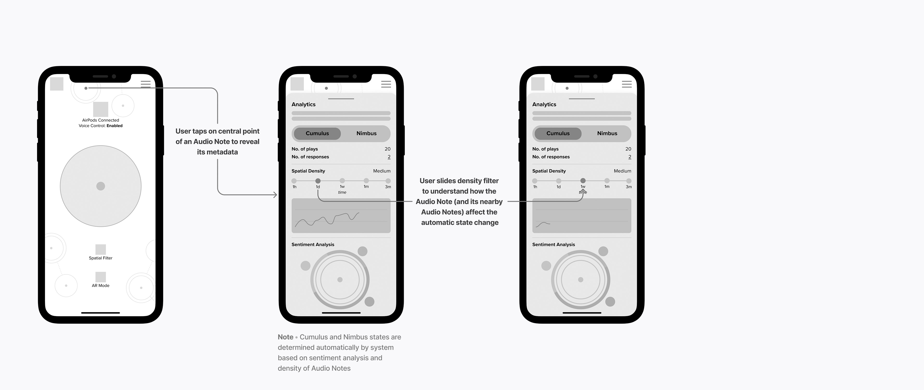
Users can tap an Audio Note to reveal metadata, including the creator’s identity, number of plays, and responses.
View entire interaction


The system responds to Audio Note density over a 24-hour period by shifting between two distinct states—signaled by a background hue change (purple or blue) and corresponding audio cues. For a deeper sense of immersion, users can also explore the environment in Mixed Reality mode.
View entire interaction
A video and sound installation composed from site-specific recordings and manipulated in SuperCollider, envisioning how familiar Los Angeles locations might feel if the Sonus app were widely adopted.
